What is synergy, continuity, CMC, brand identity?
Why is it important for a movie package?
Synergy is the combination of the poster, magazine and
trailer working together to have a greater effect than if you only see one of
the media products.
Cross Media Convergence is how the industry promote their new
media product that is easy for the audience to access. For example, websites,
games, film poster being shown online for the younger audiences and the
traditional way of promoting the film poster on the bus and billboards. Our film poster is shown on billboards, on the Cineworld website, ........ Cross
Media Convergence is important for a movie package because the products such as
the poster, magazine, trailer, games, apps all promote each other. All of the
products are effective as they are recognisable with the same makeup, pose,
colour palette, theme, main image and font so you can tell that they all link
to the same brand. This is called brand identity. In all three of our film poster, magazine and trailer, we have used the same colour palette of black, white and red as the red could symbolise the blood as zombie films are gory and the black and white go well together to create a horror effect.
Continuity is when the film continues so because the first
film is so successful they decide to make sequels as this will make it an
on-going franchise as they think the audience who liked the first film will want
to watch the second film.
Brand Identity is how the audience can recognise the media
products. So as a group we tried to have the same consistency in all media
products. The trailer, poster, and magazine have the same fonts, main image,
colour scheme, logo, iconic characteristics etc.
The Media Industry spend most of their budget trying to
promote their new film as it is important for the audience to find out about
the film so they will want to watch it as this will sell tickets and therefore
they will gain more profit.
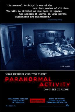
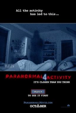
Paranormal Activity is a horror film franchise that currently has 6 films. It has its own brand identity because every film looks the same as they follow the same colour scheme of black and white, the title of the film is always in red with the number standing out in white and the layout of the poster is alway the same with quotes being at the top and the title being at the bottom with the picture in the middle. The poster always shows a black and white CCTV footage picture in the middle to emphasise how the sub-genre is supernatural and how they are being watched by ghosts.
Paranormal Activity Trailer
Paranormal Activity 2 Trailer
Paranormal Activity 3 Trailer
Paranormal Activity 4 Trailer
Paranormal Activity 5 Trailer
Own Text

The poster, magazine and trailer that our group made have the same typography of the title to keep the consistency and the title has the toxic symbol placed above the last letter of the title so it relates to the sub-genre of the film being a zombie. The poster and the trailer both show the production logo because the production logo of the film is always shown.


Incomplete U
ReplyDeleteNo examples from RMT or your own work
Some factually relevant content however limited progress for 3 hours work.